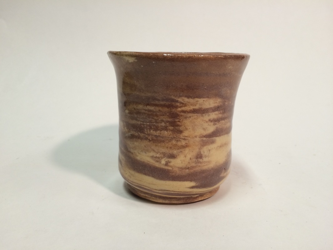
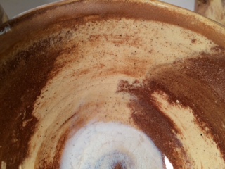
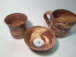
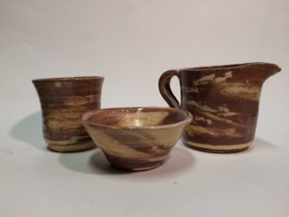
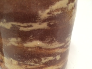
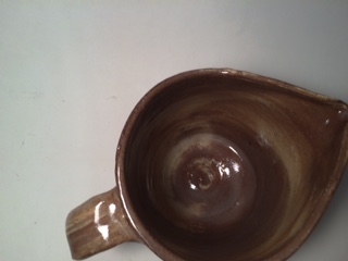
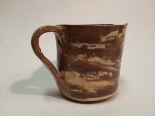
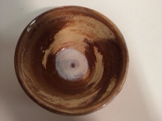
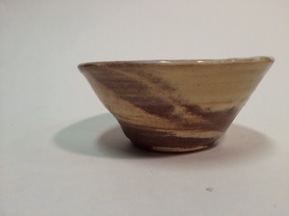
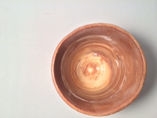
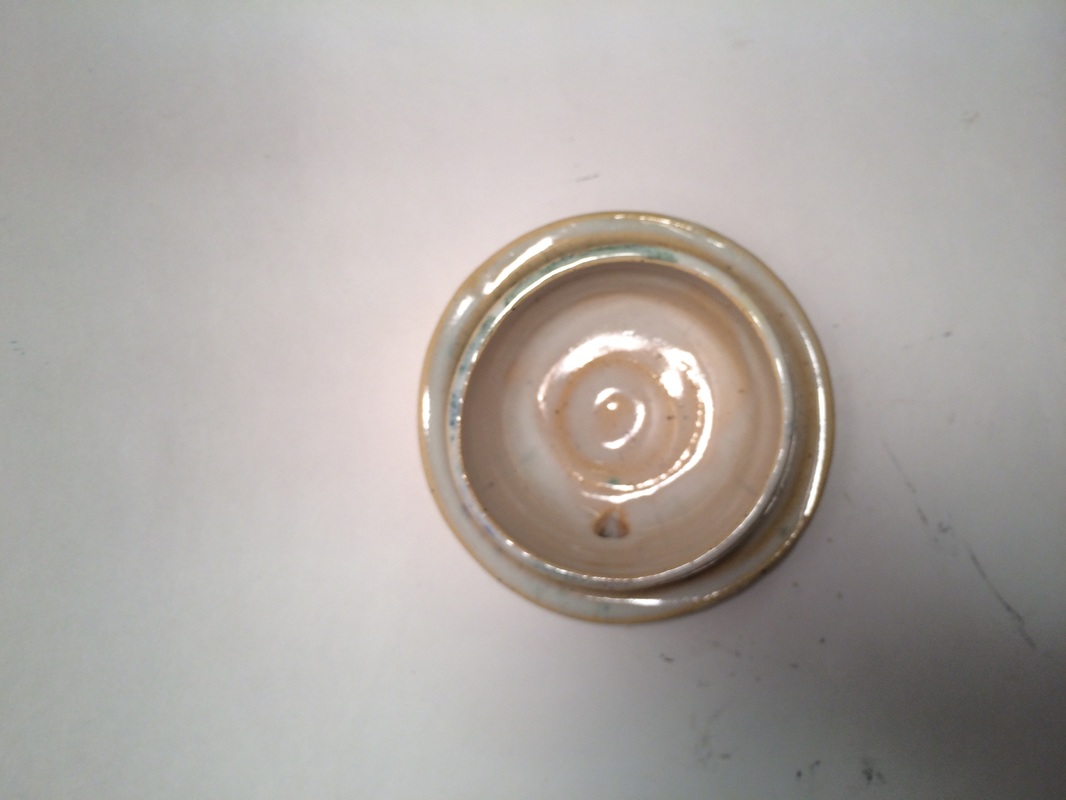
For my theme, I mixed red clay with vashon white. For the first one, I made a pitcher. It is about 5 inches tall and three inches wide. It has clear glaze to show the marbled clay. The second one is a cup. It is about 4 inches tall and 2.5 inches wide. It doesn't have a handle. It is also glazes with clear. The third is a small bowl, it is 2.5 inches tall and 3.5 inches wide. It has clear glaze, but somehow the center of the bowl filled with white. When making these projects, I mixed two types of clay for the first time. I had to scrape the sides of the projects after throwing in order to show the marbled look instead of the red slip that covered the project. The art element is color and texture. The red clay contrasts against the white clay in a way that shows movement. These pieces have a natural feeling because the red clay looks so natural and the clear glaze shows just the clay. With a lack of bright/ unnatural colors and useful pieces, they just have an organic vibe.
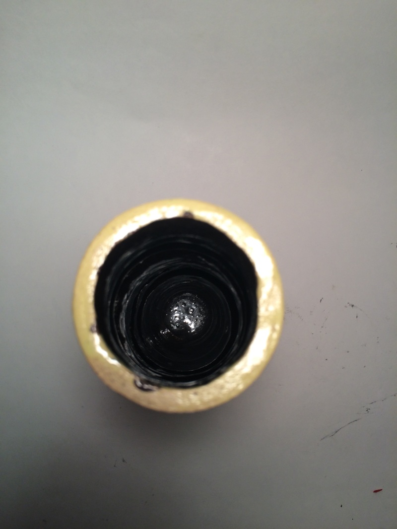 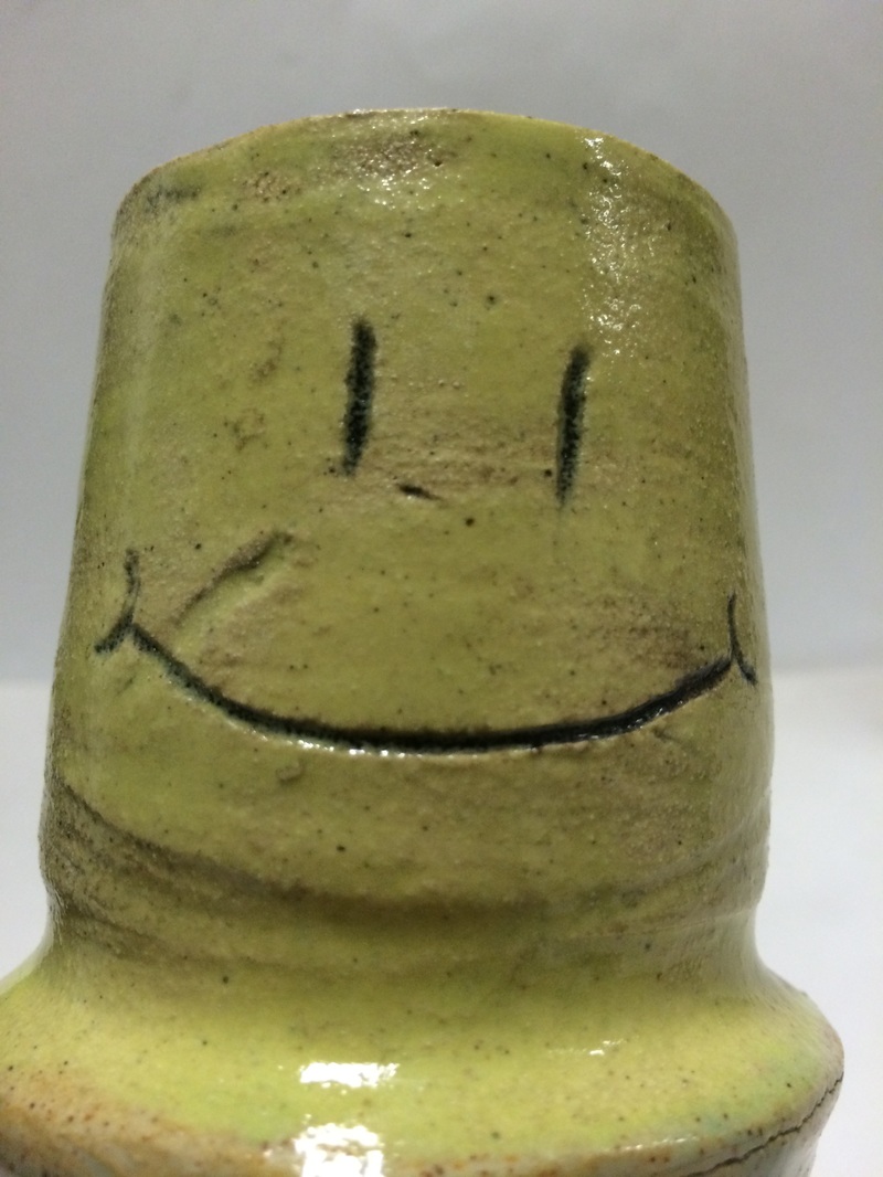 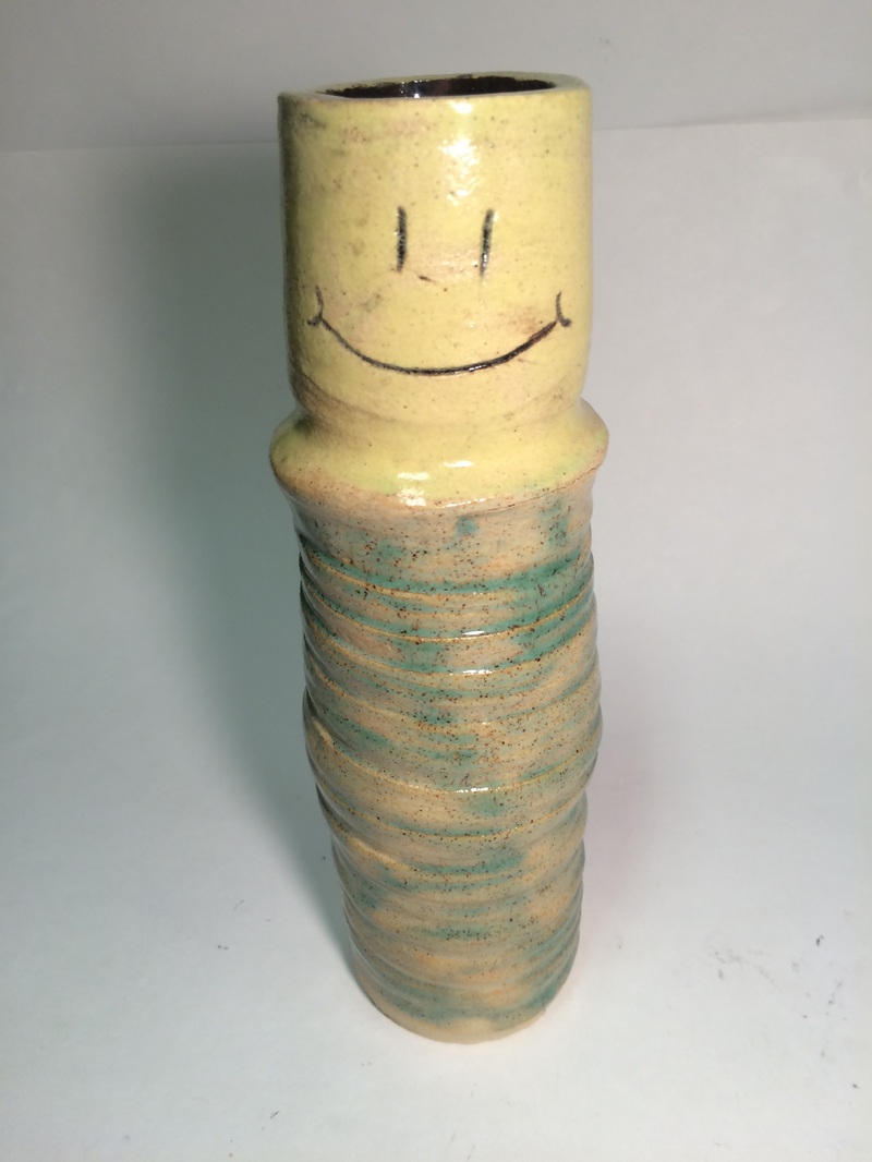 Our franken pot is about 11 inches tall and two inches wide. It has spirals down the bottom two thirds with shadow green glaze, and the top third is bright yellow with a smiley face. The inside is black. I made the middle and did the spiral up the bottom two thirds. I also helped guide Fiona and Madison as they made their parts. Fiona made the top and Madison made the base. I connected the three pieces and Fiona and Madison took turns glazing.
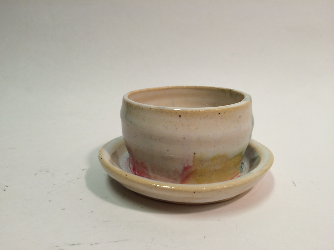 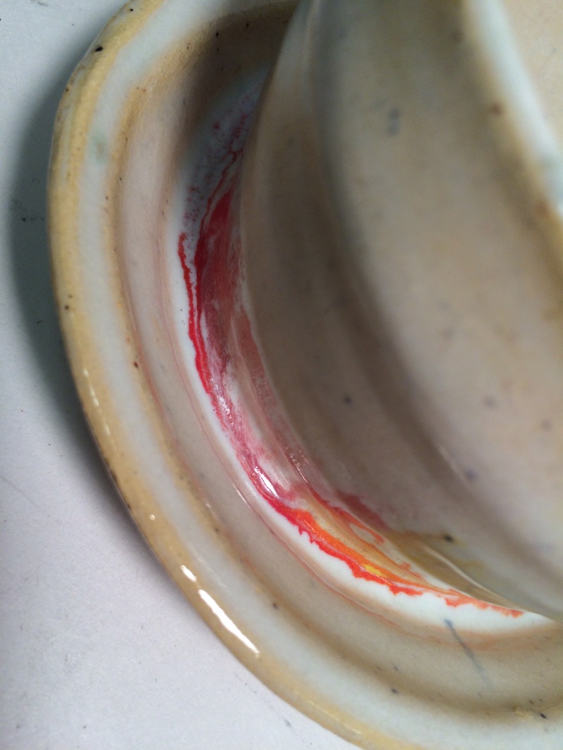 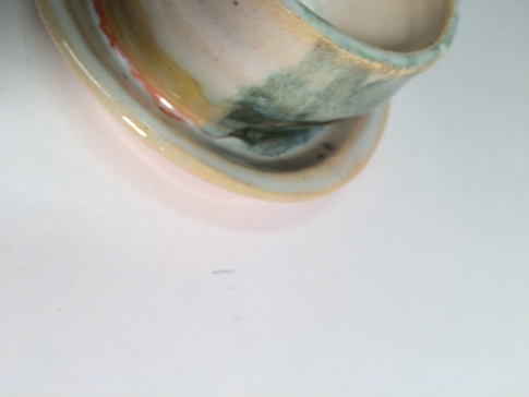  This is my Double Wall project. I made a planter. This one isn't very good but I had to rush it because my first one (It was super super good) broke on the bisque shelf. Its about three inches tall and five inches wide. It is mostly white glaze with all colors of the rainbow sort of runny-downy. I didn't use any new skills, but I strengthened my skill of opening twice and doing a double wall, something I do not have much experience in. The main art element is color. The rainbow colors give the piece movement and rhythm. Overall, it has a naive feeling. Rainbows seem so elementary and the small planter just gives it a childish vibe,
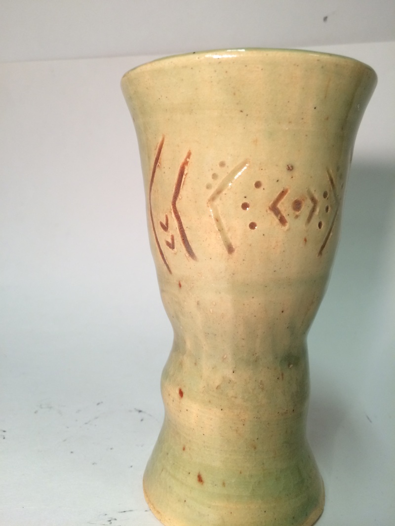 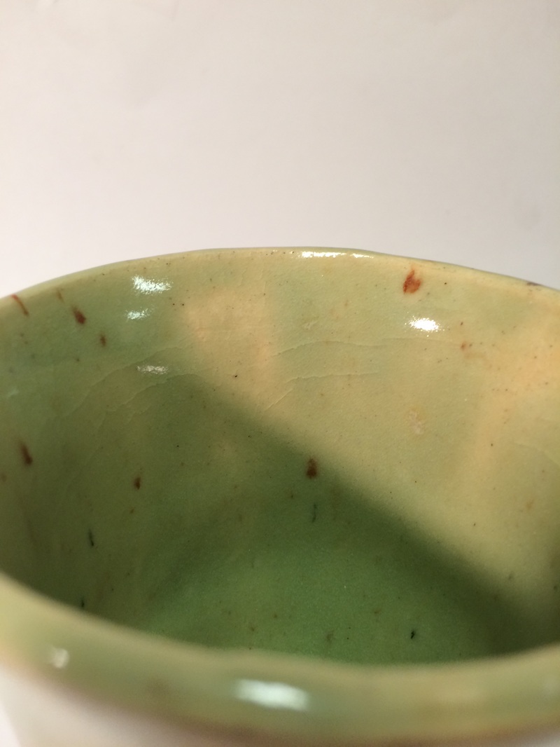 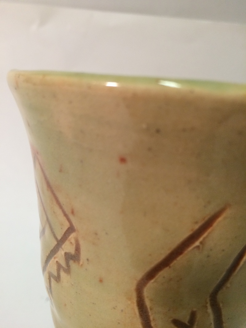 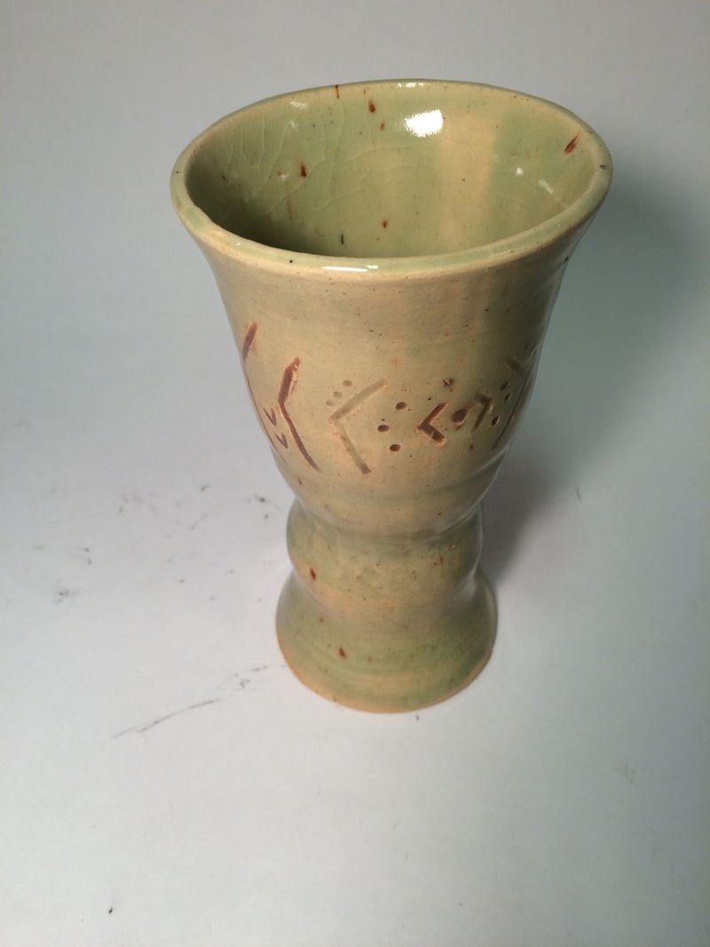 This is my multi-wheel project. I made a goblet, it is about 9 inches tall and 3 inches wide. It has a sheer green glaze with burnt orange details. My new skill was making this piece itself. I had made a frankenpot with my teammates, but never a goblet. The main art element is line, The lines create a pattern. When I made the design, I looked up native pieces to try to get an ancient look. The design looks like it is somewhat indigenous, but the glaze came out greenish and that sort of takes away from the feeling.
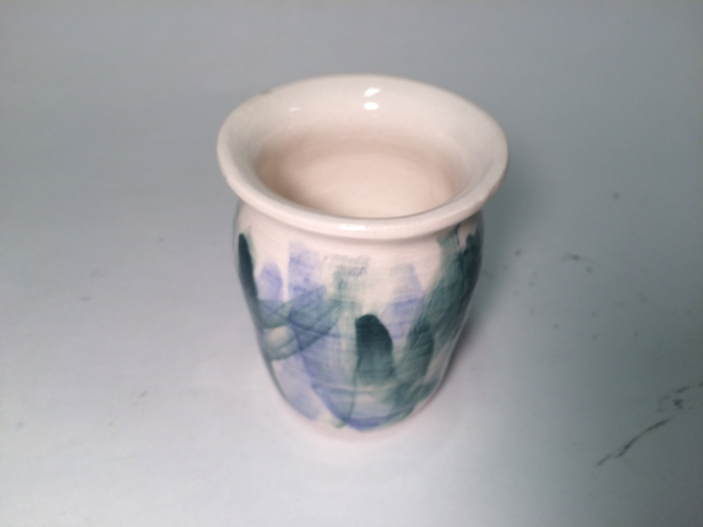
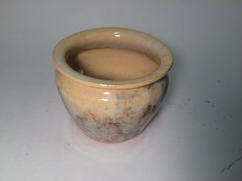 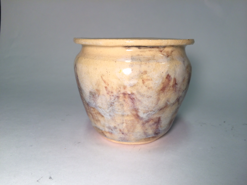 This is a vase, it is about 5 inches tall and 3 inches wide. There are random glazes on it, including different shades of tan, brown, white and black. When glazing, I painted on the colors then dipped it in water again to see if the washed-out look would be cool, which is a technique I hadn't used before. The main art element is color. The blended colors create movement on the piece, because it is such a basic shape. This has an organic mood because I used neutral, earthy colors. I am very proud because while the glaze isn't very attractive, the shape is something that I've been working on for a long time. I think I did a good job as far as achieving the proportional, "Golden Rectangle" shape.
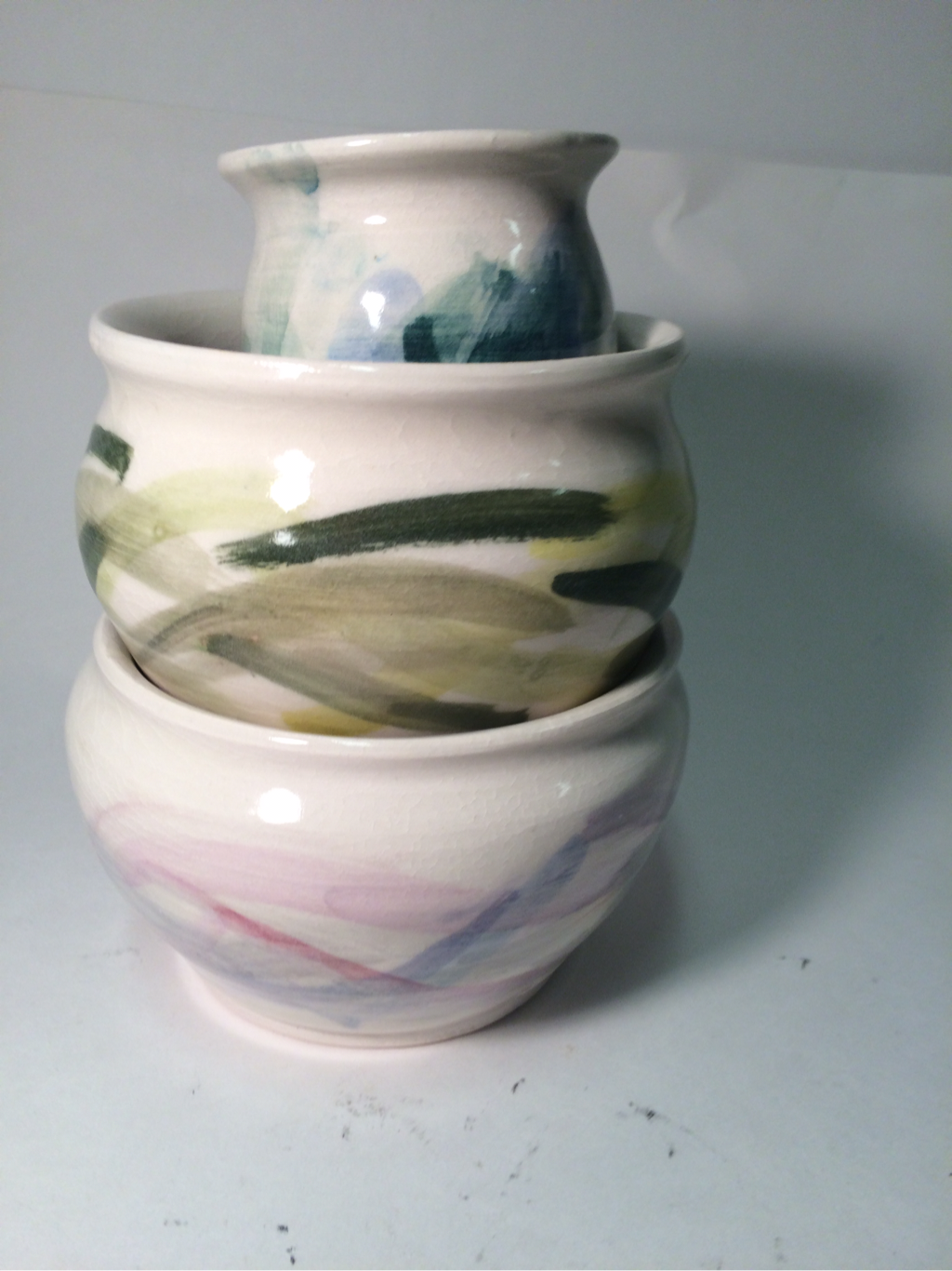 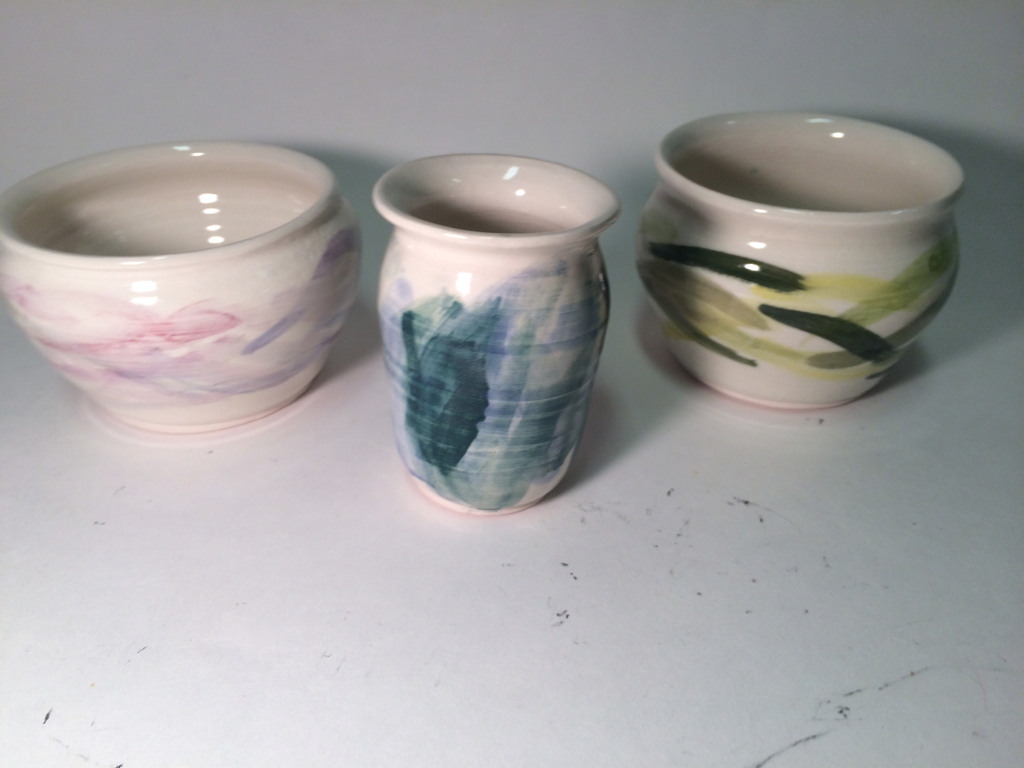 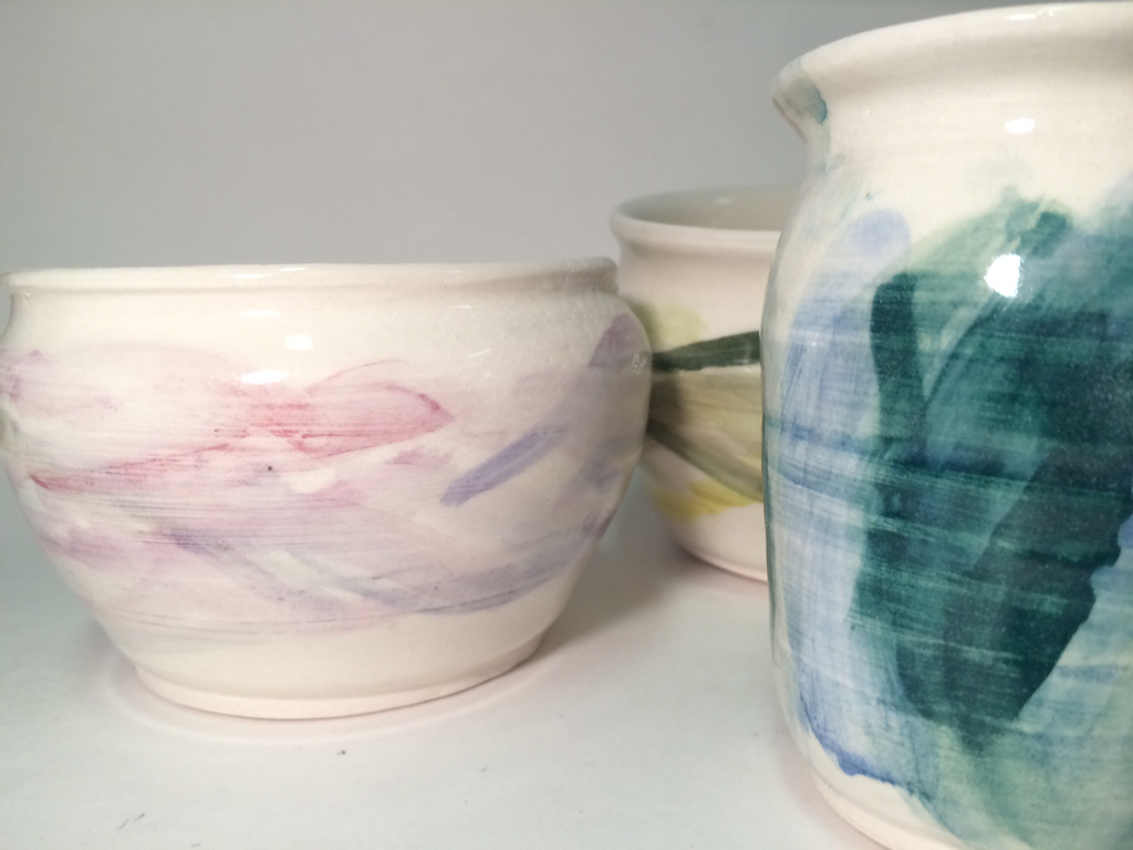 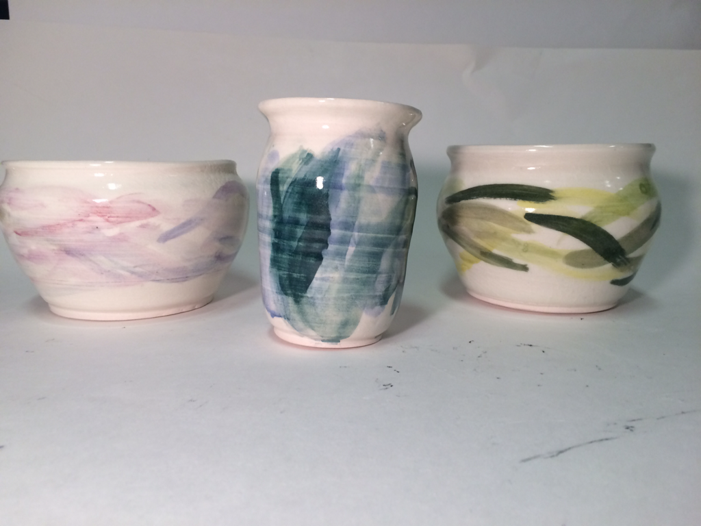 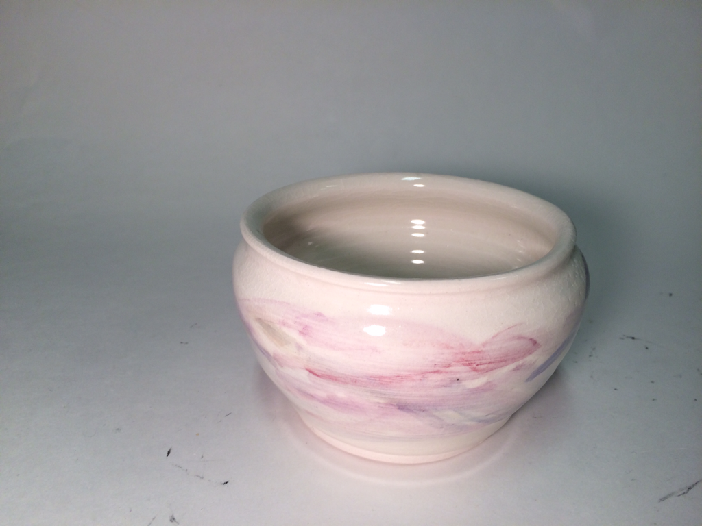 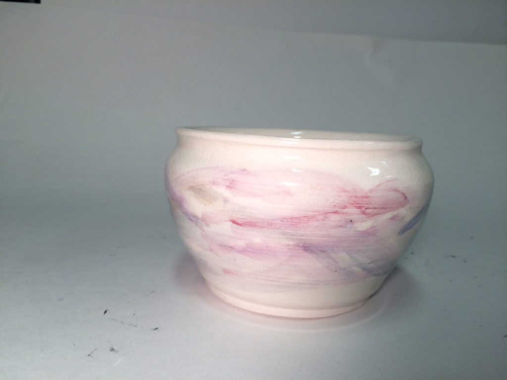 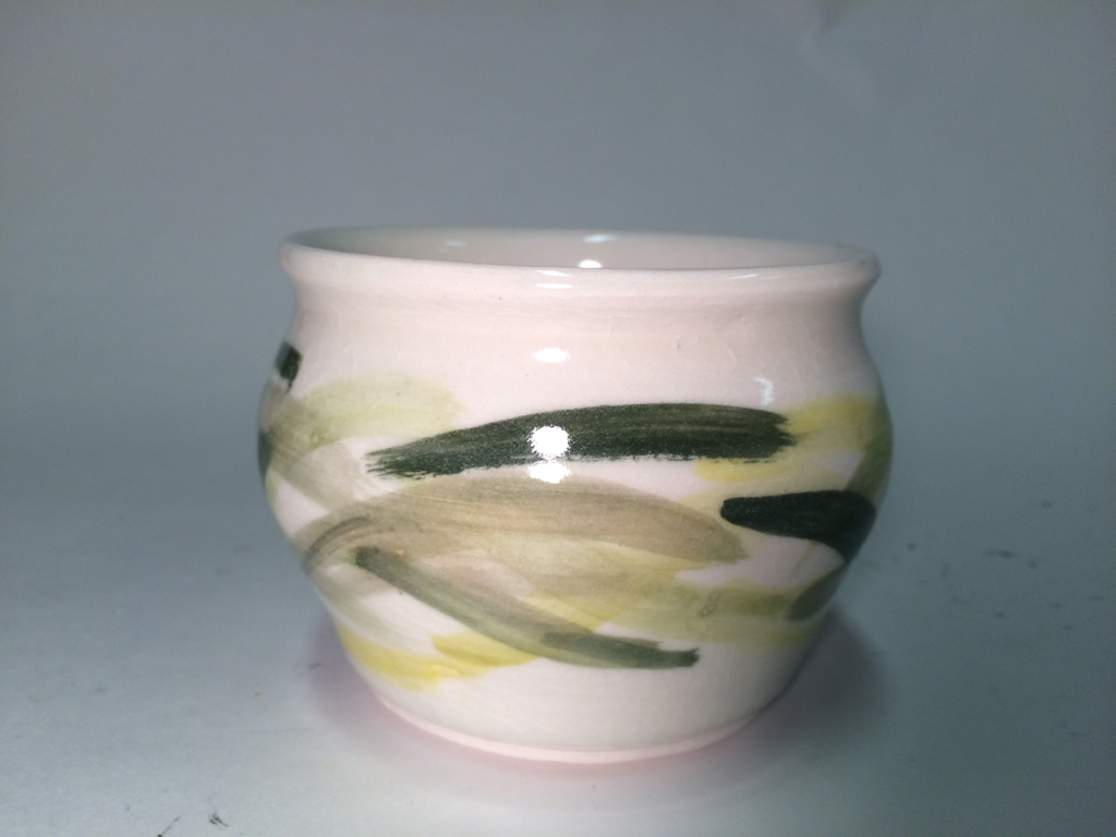 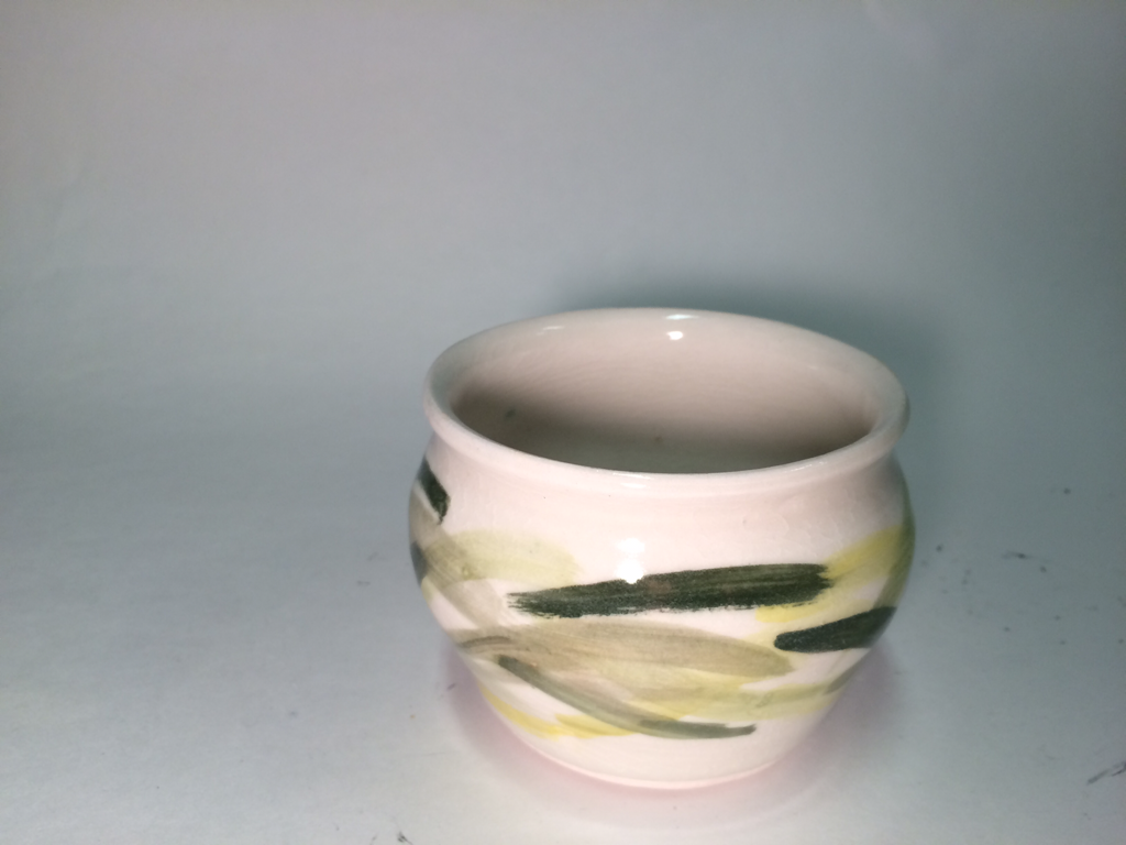 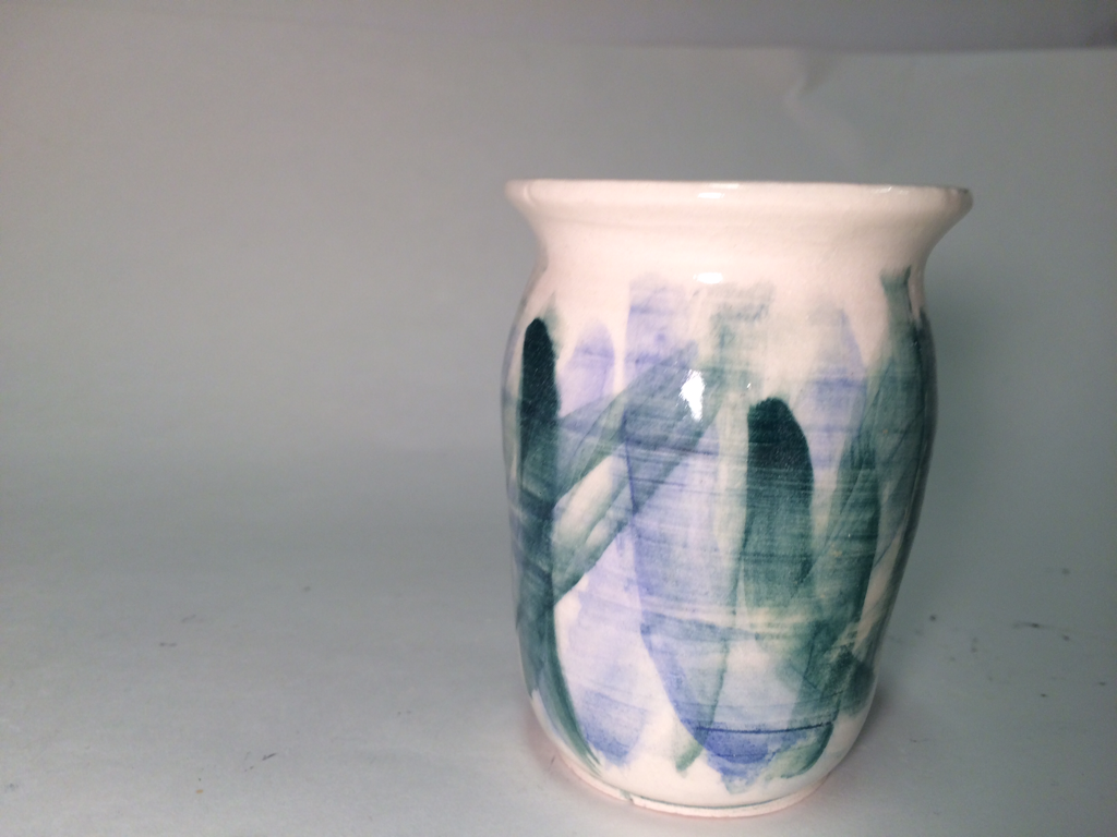  This is my Set of Three project. I made three porcelain vases, ranging from 3 inches to 4.5 inches tall. There are two short and stubby ones and one taller and thinner one. They all have clear glaze with strokes of watercolor on them. One vase has different shades of yellow and green, another has shades of blue, and the third has shades of pink and purple. For this assignment, I didn't really learn any one skill but I tried to focus on the shape of the pieces and planning the set rather than just seeing what happened when I threw. Although they didn't turn out exactly the right shapes I had in mind, I think it is cool that I had planned them out ahead of time. Instead of throwing and making it work for the assignment, I decided what I wanted to make and made it, which is new for me. The main art elements are color and pattern. The different colors contrast the three pieces, but they same pattern unifies them into a set. The pattern is very light and the colors against the white porcelain give the set a very fresh and clean feeling.
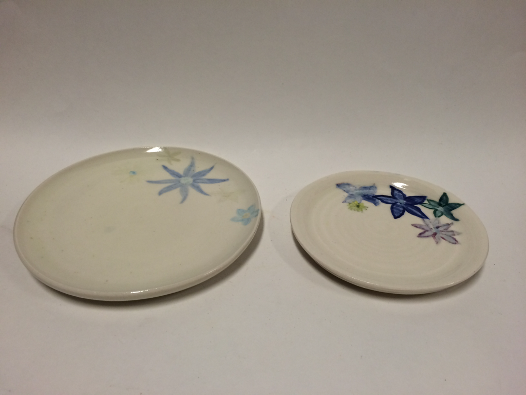 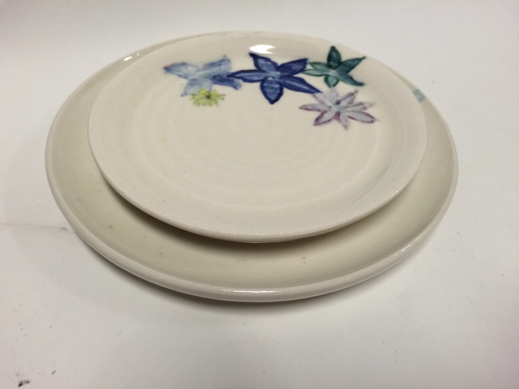 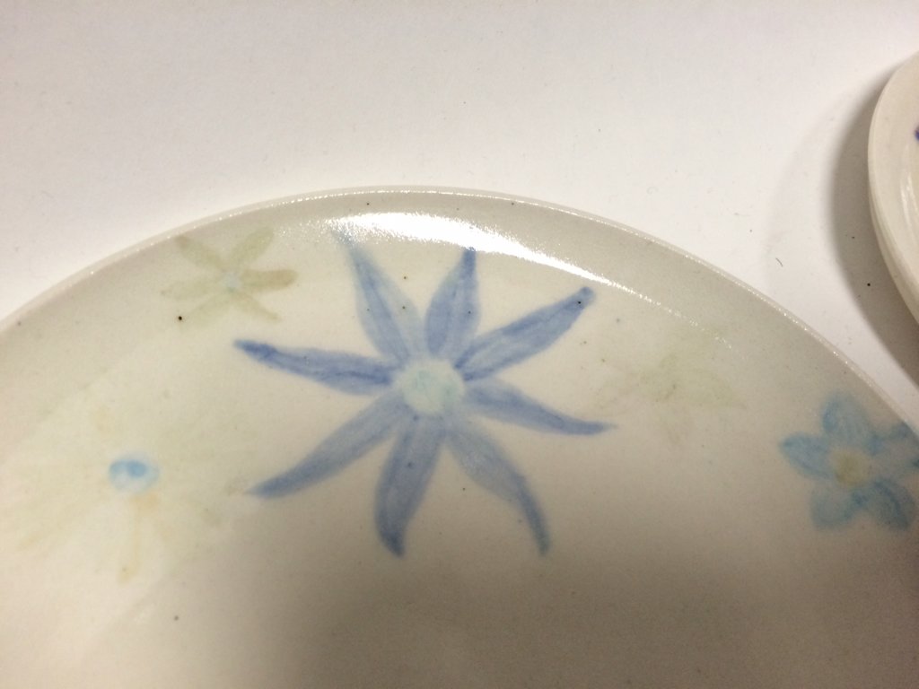 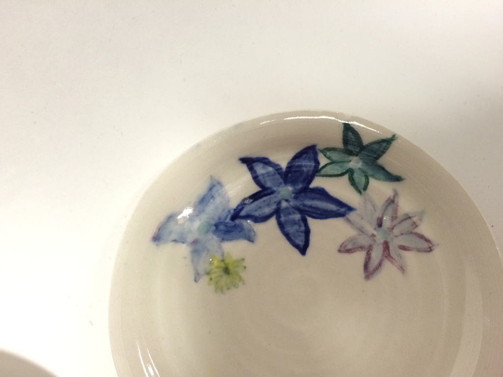 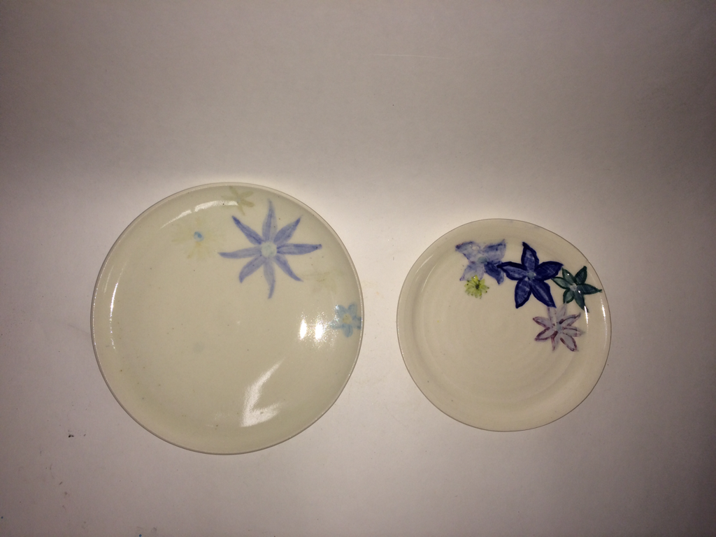 These are two plates made of porcelain. The bigger one has a 7 inch diameter and the smaller one has a diameter of 5.5 inches. They have clear glaze with watercolor flowers painted on, but the water color faded on the bigger plate. When making these I learned how to do a double foot ring, which was really interesting. The flowers are different shades of blues, and the colors and shapes create an emphasized focal point. Although I'm not completely happy with the faded flowers, I like the simplicity of these pieces. The flowers look clean on the white porcelain and create an overall pretty set of plates.
My choice project is a vase. It's about 5 inches tall and 3 inches wide. It is skinnier at the bottom and gets wider at the top. It has a ring of green waves about 2/3rds of the way down and is covered in clear glaze. When making this vase I focused on trying to apply the golden ratio. The green watercolor draws your eye to the waves and their smooth lines that create movement and emphasis. I tried to use the rule of thirds and apply the golden ratio, I was not super successful but it's a good attempt. The ratios of the base and the lip give it an overall good shape. 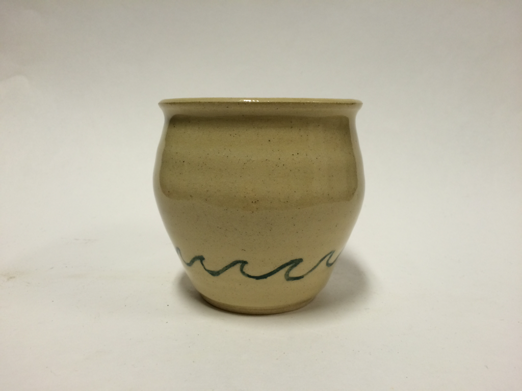 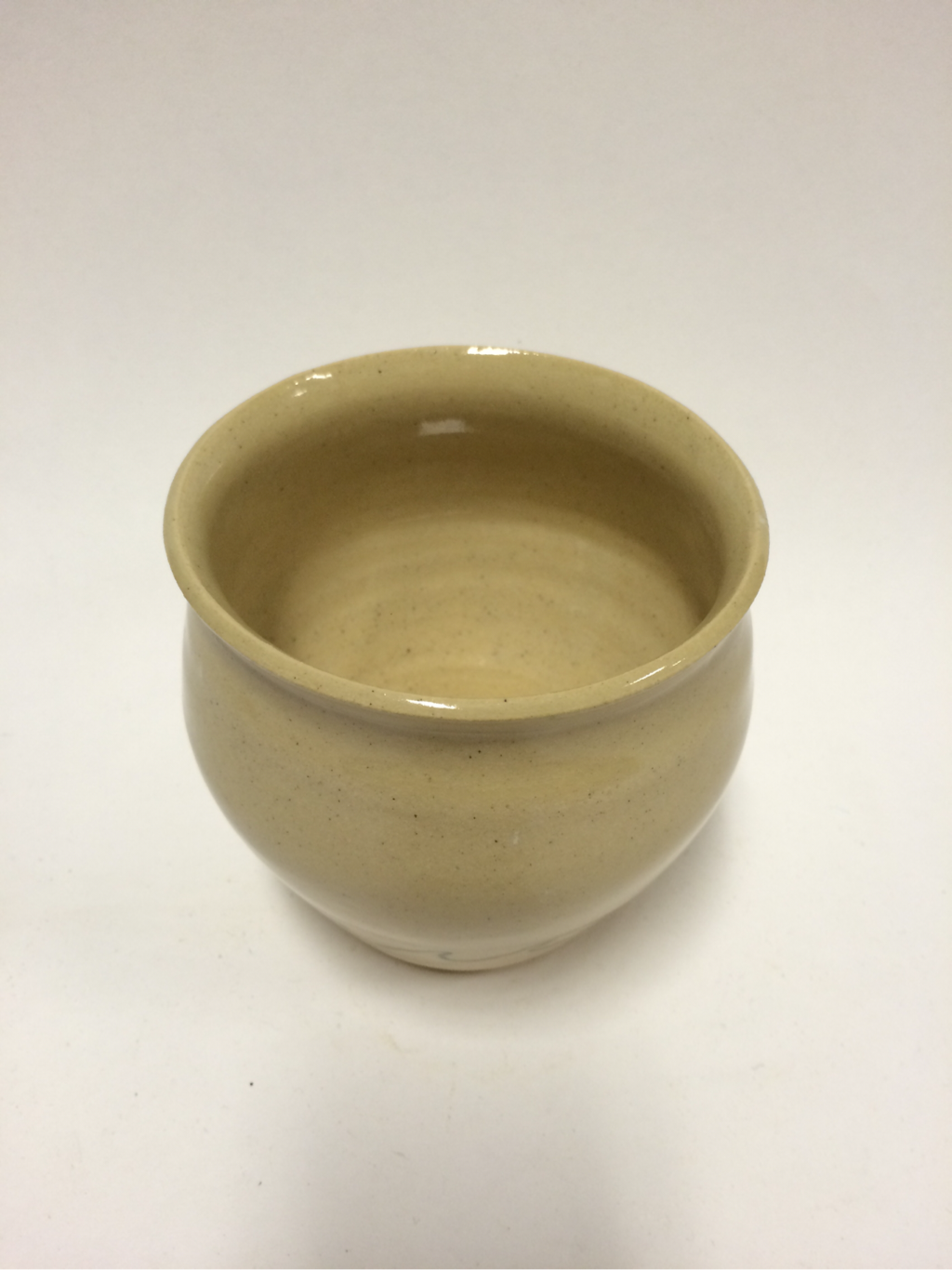 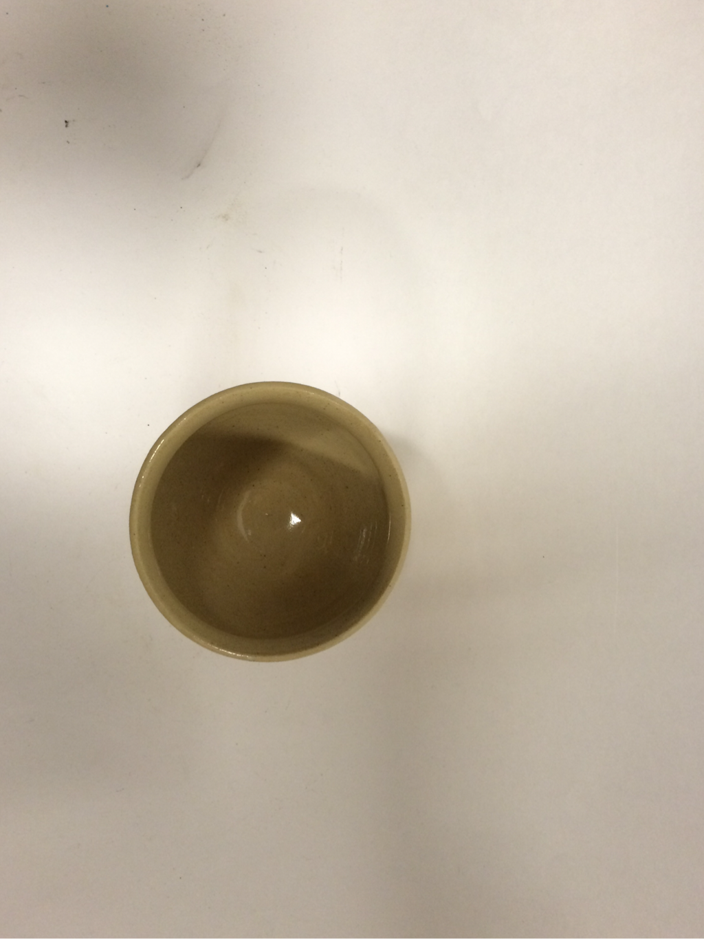 My extra credit project is a wheel altered. It is very very small, about 2 inches by 2 inches. It is a little dish/cup that I will probably put on the giant bookshelf in my family room. I saw the technique I used to alter it online, so I wanted to try it. I basically took one of the mini wood tools and pressed into the clay to leave a scalloped pattern/texture. The scallops are filled with different shades of blues and green. The texture/form creates a pattern, but the mix of colors make sure it isn't an exact pattern. Also, they are not evenly placed/distributed, so there is a pattern but it is not super defined. 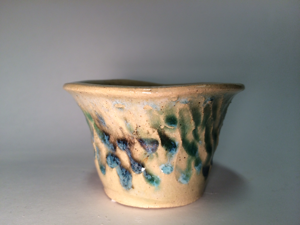 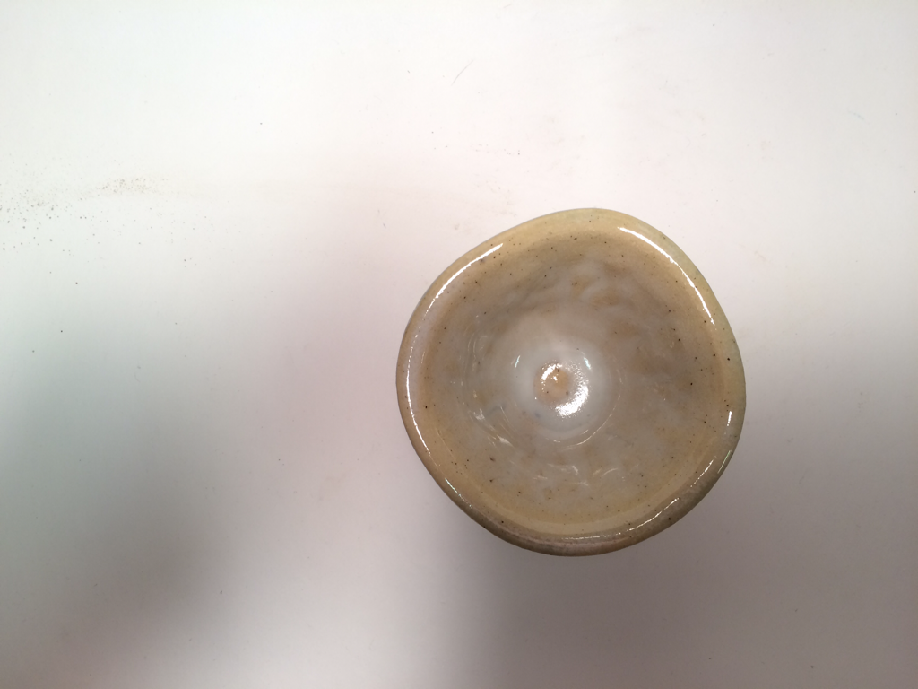 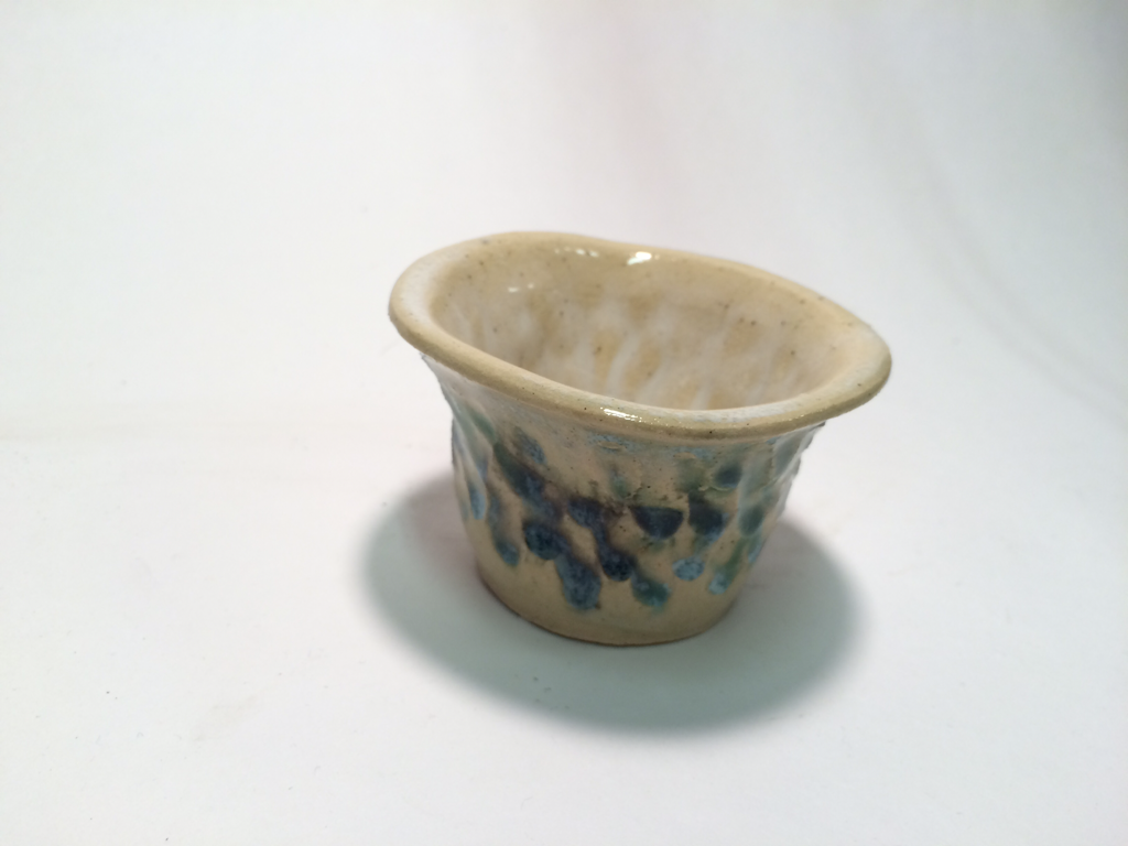 For my hand and wheel project, I made a mug with a handle. It is about 4.5 inches tall and 2.5 inches wide, not including the handle. When I made this I had to re-learn how to pull a handle. Although it was not a skill that I learned for the first time, I had not pulled a handle in three years so I had completely forgotten what to do. It has shadow green, turquoise, and blue-green glazes. Once again, I used blue-green and it turned blackish brown, which made me very upset. The different colors create a really cool contrast. There are some points where there is a sharp line between the two colors, but in others they sort of blend together in an ombre style. The contrast in the colors make the simple piece more interesting because there is more to look at than just a cup with a handle. 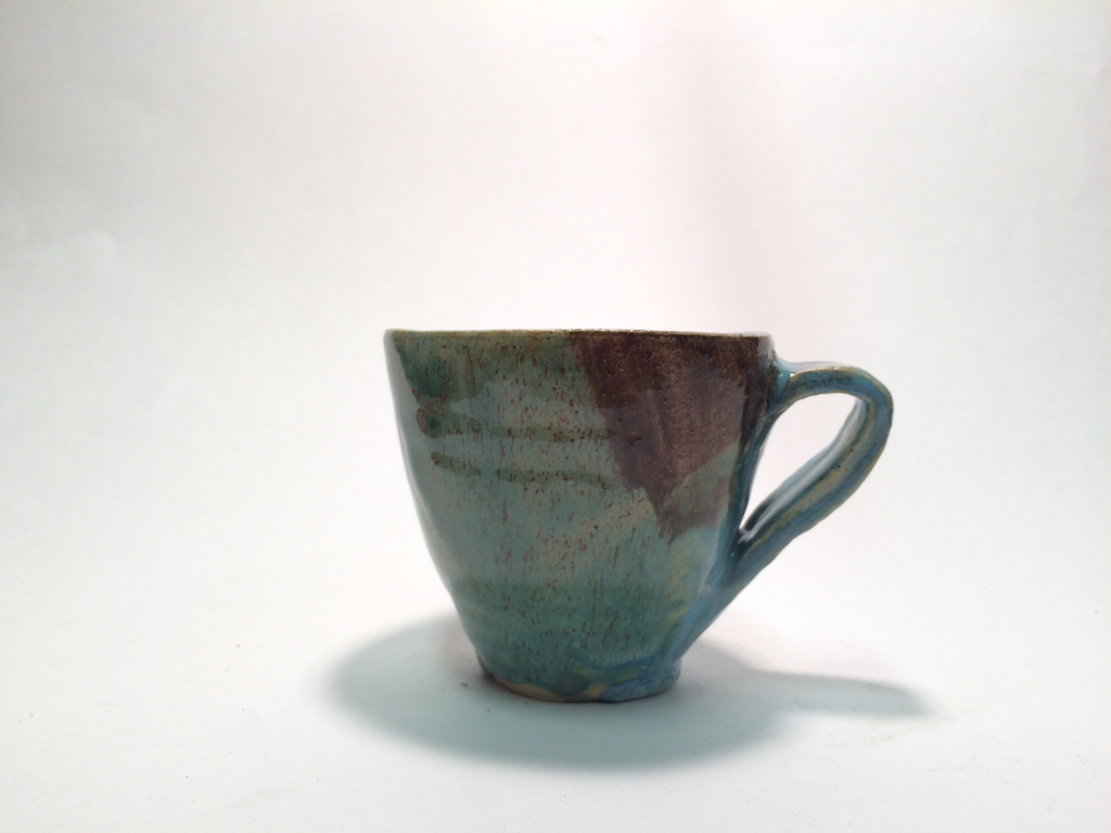 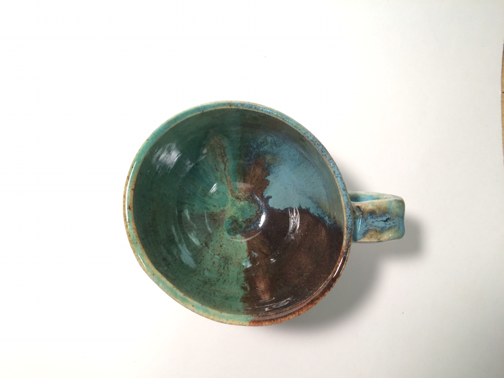 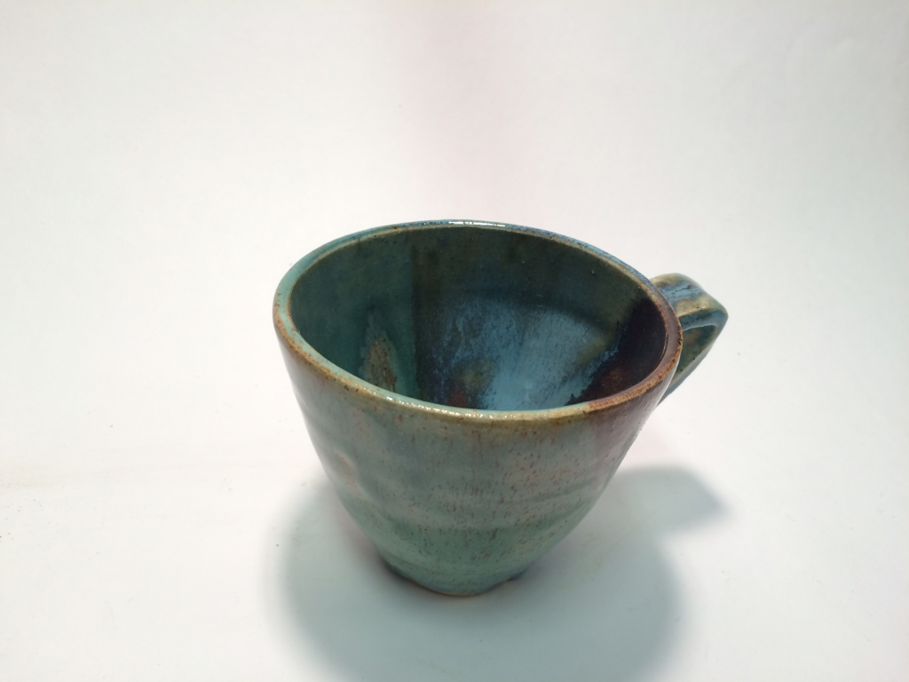 |
